UPDATED JANUARY 21st 2023
We’ve all experienced slow-loading sites, squinting at fonts that aren’t legible or navigating sites that don’t look good on mobile. For people with disabilities, these problems can completely restrict internet use, even if they’re just a slight inconvenience to us.
Everyone should be able to use accessible web content, design, and tools. Making it easier for people with disabilities to see, understand, contribute, navigate, and interact with the site is key.
Accessibility isn’t new, but it’s easier than ever with some basic knowledge and help from a developer/designer.
Make your website more accessible to everyone and you’ll not only stand apart from the competition you’ll avoid lawsuits.
Over 98% of the top 1 million websites fail accessibility tests. Why should you be worried about your website if so many aren’t compliant with W3C standards of accessibility? 15 percent of the world’s population has a disability that makes it hard for them to access the web. Having an accessible website will give you an edge over your competition. And avoid potential lawsuits.
How to Make Your Website Accessible
First of all, web accessibility applies to all disabilities that affect access to the web, including:
- Vision
- Hearing
- Cognitive
- Neurological
- Physical
- Speech
Providing multiple ways for users to access your content is the best way to make sure your website is accessible. With that in mind, consider these design guidelines:
- Make images accessible by adding descriptive alt text on all images
- Add captions to videos
- Allow users to navigate your website with a keyboard instead of a mouse
- Make sure your site’s layout and structure are logical, intuitive, and easy to use
- Colour contrast, white text on blue background for example
- Larger font sizes on call to actions & buttons — larger text, button size and contrasting colours
Are you on one of our care plans? Get started on making your website more accessible today.
Give Users The Option To Enlarge Font Sizes
Text that’s too small is hard to read for people with low vision. They have to use specific font settings to browse your website which can mean having the ability to enlarge the font without breaking the website layout. This is done in a couple of different ways, one of which is to ask your developer to include an alternate stylesheet when designing the site so that the font can be enlarged and the site will still look pretty much the same in terms of layout.
Keep Colour Contrast Sensitivity in Mind
People with vision impairments such as retinitis pigmentosa, glaucoma, diabetic retinopathy, and cataract have low colour contrast sensitivity.
When designing your web pages, make sure to have a high contrast between the foreground and background, such as yellow letters on a black background.
Also, try to avoid using any JavaScript or CSS features that will prevent visually impaired users from increasing the contrast.
Just like the text size, color contrast is also critical for buttons.
While black text on a white background has the highest readability, you can also use a combination of black text on a yellow background and blue text on a white background.
Avoid using combinations like green text on red background and vice versa as they are hard to read.
Add Keyboard Navigation
For blind and visually impaired users, navigation is a challenge.
As they can’t use a mouse to browse the site, you have to incorporate keyboard navigation into your website.
Blind users will use Braille keyboards to access your site.
Make sure disabled users can access all interactive elements of your website, including:
- URLs
- Anchor text
- Drop-down menus
- Widgets
- Forms
- CTAs
- Dialog boxes
Also, make JavaScript widgets accessible with the keyboard.
Alternatively, you can use HTML links, buttons, and form fields alone to make sure all elements of your website are keyboard-accessible.
Make Video and Multimedia Accessible
Videos and other multimedia elements on your website play a critical role in increasing the user-engagement on your website.
While blind and visually-impaired users can’t see visuals, deaf users and those hard-of-hearing can’t hear audio.
You can use an audio description to describe visuals-only parts such as images, gestures, and changes in settings, among others. It will help blind users to enjoy the video. Include the pause button on autoplay.
You can provide text captions that synchronize with the video and audio tracks for users who are deaf or hard-of-hearing.
Make sure to use the right colour contrast to highlight the captions correctly.
Finally, you will have to use an accessible multimedia player.
Fortunately, HTML5 players provide a better chance of incorporating accessibility.
Use Descriptive URLs
Screen readers can quickly and precisely read descriptive URLs, offering blind and visually-impaired users some context.
Meaningful descriptions also make it easier to skip to the right content.
For example, when describing the link of the “About” page, keep the following mind.
- Hard to Read: yourwebsite.com/about
- Easy to Read: yourwebsite.com/about-our-company
Avoid using anchor text like “Read More” or “Click Here” anywhere on the page.
Also, don’t add links to images that can’t support Alt Text.
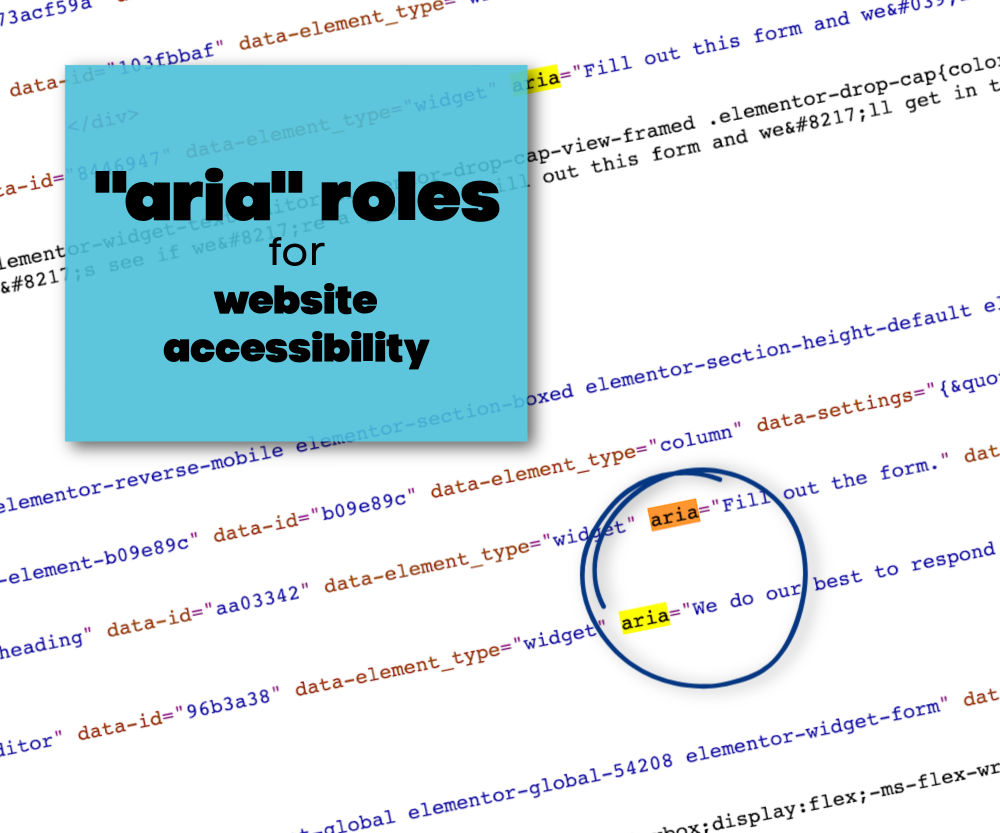
Use ARIA Roles
ARIA stands for Accessible Rich Internet Applications. It helps make dynamic content more accessible and provide more information or context about a website element to screen readers and other assistive tools.
You can add the ARIA role using a role=”<role type>” attribute.
The six most common categories of ARIA roles include:
- Landmark: Screen readers use this role for navigation.
- Document Structure: It offers a structural description of a section.
- Widget: It describes interactive elements lacking semantic equivalents in HTML.
- Abstract: It helps organize and streamline a document.
- Window: It creates a subcategory or subsection of the main document.
- Live Regions: It helps assistive tools to detect dynamic content changes on a webpage and alert disabled users.
Adding ARIA roles to your website is a key component in ensuring your website meets accessibility standards. However, only people with access to source code and with the knowledge of ARIA and HTML5 can and should make these changes. The good news is we are in your corner! Contact us to learn more about how we can get started on retrofitting your current website to meet WCAG standards of website accessibility.
Make Forms More Accessible
One of the first things we do when considering accessible features on websites is to work on forms. Having forms that are accessible is critical to your website performance and of course, you want people to be able to fill out your forms without issues. So here’s what to focus on when thinking about how to make them accessible.
Don’t Use Placeholder Text Only
Online forms often use placeholder text (the often light grey text contained within a field) for instructions on how to fill out the form or to describe various elements to save space. However, we need to rethink that if we want all visitors to have a good experience when filling out your form.
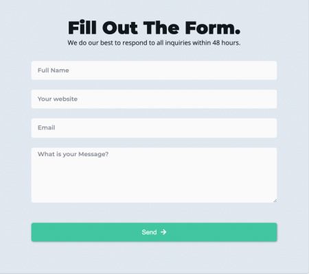
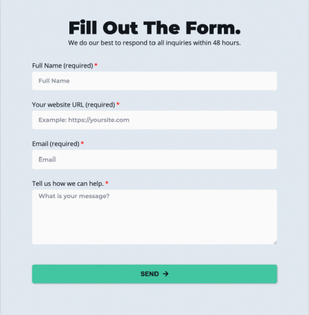
Visually impaired users that use screen readers or have low vision may not be able to read the placeholder text due to the low contrast it and the background. Some users who have cognitive disabilities may not understand that they are to fill out the field, as it may look like it has already been filled out.
Using labels does take up more space but if we want all website visitors to be able to fill out our forms, then isn’t it worth it? Besides, there are other styling options we can use to make the form smaller, for example, reduce the space between the fields and below the heading, “Fill out The Form” or break up the form into multi step forms that show the progress being made. Just make sure to limit the number of fields that are visible to four or less.
Placeholder text is considered to be non-label text, which means screen readers will usually skip over it completely. As a result, blind users won’t be able to understand what is needed from the form.
So, instead of placeholder text, use the <label> tag or an ARIA attribute that screenreaders scan easily. Or in the case above, don’t use placeholder text at all. Also, use the highest text and background contrast to ensure that low vision visitors can use your forms.
Error Recovery and Form Completions
Once a user fills out a form, they will need to be notified that the form has either been filled out correctly or that an error occurred. Have you ever filled out a form and clicked ‘submit’ and nothing happens? That may be due to a lack of correct coding, lack of colour contrast, or the form doesn’t scroll to the place or field where the error occurred. It’s frustrating for the average users for sure, but can you imagine what it must be like for someone who has a visual or cognitive disability.
These steps will make it easier for blind and visually impaired people to use the site. Keep in mind, though, that you don’t want a cluttered web form. Make it as simple as possible.
Ideally, it’s better to incorporate accessibility into the beginning of the development and web design process than to retrofit it afterward. It can be time-consuming and expensive.
However for many, it’s not always possible, especially if this is the first you’re hearing about it. And when it comes to user experience, accessibility can seem intimidating to those who are just getting started.
Here’s a list of further areas to improve accessibility on your website.
More Accessible Areas to Improve on Your Website
- All focus elements have clear outlines – buttons, form fields
- browser enabled
- colour contrast meets requirements
- use skip links
- underline link text only
- language declaration for each page
- include pause button on autoplay
- link text is meaningful
- include notification when opening a page from a link
- don’t use all caps. ever.
- avoid entrance animations like parallax, background videos
- avoid infinite scroll, instead use page numbers
- headers for tables
- pop ups need to be accessible
- use left aligned text as much as possible as it’s much easier to read
- headings are in order — h1 – h6
Website Accessibility in Canada
- Web accessibility in Canada: In Canada, the Accessible Canada Act came into effect in 2019, which aims to ensure that all federally regulated organizations, including websites, are accessible to people with disabilities. This includes providing an accessible alternative format for any information or communication that is made available to the public. Additionally, the Canadian Human Rights Commission provides guidelines for making websites accessible, which are based on the Web Content Accessibility Guidelines (WCAG) 2.0.
- WCAG 2.0 compliance: Meeting the guidelines set out in WCAG 2.0 is considered the standard for web accessibility in Canada. These guidelines cover a range of accessibility issues, including text alternatives for images, clear headings and labels, and providing keyboard-only navigation.
- Accessibility testing: Testing your website for accessibility is an important step in ensuring compliance with Canadian web accessibility laws and guidelines. This can be done using automated tools, as well as by getting feedback from users with disabilities.
By following these guidelines and best practices, Canadian websites can ensure that they are accessible to all users, including those with disabilities. It’s important to regularly review and update your website to ensure that it remains accessible and compliant with Canadian web accessibility laws and guidelines.
There’s a lot more to accessibility than what I’ve laid out above. It’s a journey so don’t stress if this seems like either too much to do yourself or too expensive. If you are on one of our care plans you can add accessibility compliance to your monthly subscription so we can get started on giving your website visitors the best possible experience on your website. We can also create an accessibility statement to let website visitors know about the progress towards achieving an accessible website.
This post will be updated so be sure to bookmark it!